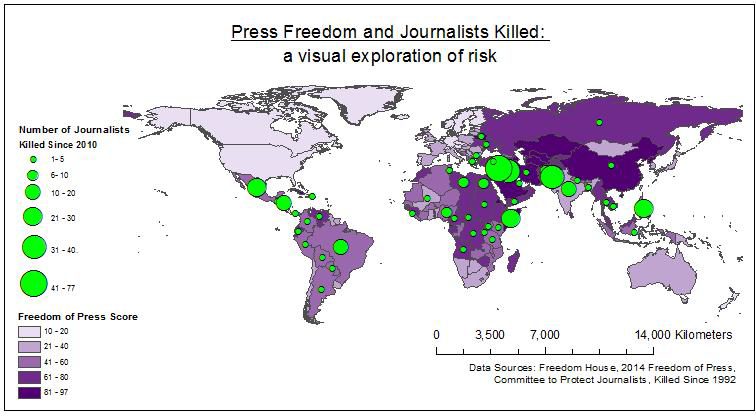
Kiyomi French, a graduate student in Masters of Spatial Analysis program, illustrated just how strongly correlated the number of journalists killed is with press freedom in this map she made for her cartography class. Here’s why she took on the project and what she found:
You’re not a journalism student – why did you do this map?
My dad was a journalist for the Globe and Mail and he was always travelling and sharing his amazing stories with us. Sometimes my mom, brother and I would get to tag along on these trips and we went to places such as Jamaica and the Cayman Islands. I always thought he was so lucky to have a job that allowed him to travel like that. When my brother and I got a little older, my father started to share his darker stories with us—of corruption and the troubles many of his colleagues have faced because of it. My brother followed in my dad’s footsteps and he writes for a paper in the Northwest Territories and I’m always interested to hear about his investigative work and read his stories. It makes me feel like he’s not so far away. I chose to map this topic because I thought it would be an effective way to raise awareness of the dangers associated with reporting around the world.
What does the map tell us?
It shows the total number of journalists who have been killed (motive confirmed) in each country since 2010 and relates those numbers to the 2014 World Press Freedom scores, which are assigned annually to reflect the level of freedom journalists and organizations have to communicate information within each country. The overall goal of this map was to visualize the global disparities in press freedom and explore links between press freedom and the dangers associated with being a journalist. The map shows that over the past five years, journalists have been killed all over the world and that the risk is generally greatest in areas where press freedom is more limited.
Why should Canadian journalists care?
This map depicts a strong correlation between high freedom of press scores and high kill counts, suggesting that press freedom scores strongly indicate how safe a country is for working journalists. However, there are also several outliers, mostly notably India, where a relatively high level of press freedom is nonetheless associated with quite a high number of murders of journalists, a correlation that suggests other variables come into play. Outliers like this suggest that journalists should not use freedom of press scores alone to gauge how careful they should be when working abroad.
Did anything surprise you about the map?
When I started creating the map, the one thing that really surprised me were the statistics. I chose to map only the total number of journalists confirmed killed by crossfire, murder or dangerous assignments. However when other media workers and those who were victims of unsolved murders, or went missing, imprisoned or exiled are also considered, I found the number of journalists who have run into problems around the world while on assignment to be shocking and sad. The statistics go back as far as 1992 and are available from the Committee to Protect Journalists website.

