By ILINA GHOSH
Staff Reporter
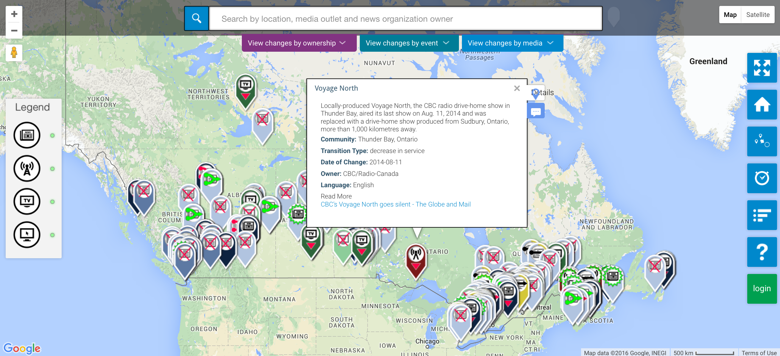
Canadians can help track changes in the availability of local news in communities across the country by contributing to a new interactive map.
The crowd-sourced map, produced by a team of Ryerson and University of British Columbia researchers, is “a way for people to actually see the major disruption underway in the local news sector,” says April Lindgren, the map’s co-creator and principal investigator for the Local News Research Project at Ryerson University’s School of Journalism.
“I’m hoping the map will help us understand if certain types of communities, whether it’s due to their size or income or location, are being more hard hit by the shake up in the news industry than other types of communities. I also hope it will raise questions and prompt discussions about what, if anything, should be done about this,” said Lindgren, an associate professor at Ryerson’s School of Journalism.
The map is being published amid growing concerns about the state of local news across the country.
A recent Angus Reid poll indicates 78 per cent of Canadians surveyed consider the loss of small-town newspapers as “very serious” or “serious.” In January, a study commissioned by the watchdog group Friends of Canadian Broadcasting warned the CTRC that without intervention, half of Canada’s small- and medium-market television stations could disappear by 2020, and with them, more than 900 jobs. In February, the House of Commons Canadian Heritage Committee passed a motion calling for hearings on “how Canadians, and especially local communities, are informed about local and regional experiences, through news, broadcasting, digital and print media.”
While Lindgren focused on the map’s content, the map itself was created and designed by UBC’s Jon Corbett and his SPICE (Spatial Information for Community Engagement) Lab.
The researchers have already posted data on the map going back to 2008. “We’re interested in what people think about what’s happening and whether they think their local media outlets are keeping them informed,” Lindgren said, noting that the map includes data going back to 2008, “because that was when the crunch really hit in terms of news organizations really starting to suffer.”
The researchers are now inviting members of the public to draw upon their local knowledge to add both historical information as well as details of new developments so that the map will become richer and more useful over time.
“We’re really interested in crowd-sourcing and we’ve developed an application that allows people, in a relatively seamless way, to add information to a specific place on the map,” says Corbett, an associate professor of community, culture and global studies at UBC’s Kelowna campus.
Visitors to the site can add markers indicating the launch of new local news operations, the closure of local outlets, and service increases and reductions at local online, radio, television and newspaper outlets throughout Canada. They can also turn filters on and off to see changes in cities, towns and rural areas in terms of:
- Type of media
- News outlet ownership
- Type of change that occurred
- Time period
- Location
- Language of operation
Corbett says the participatory nature of the map and the complex data it presents makes the map unlike anything he has done before.
“The thing is that [all the media types included] are transforming continuously,” he said. “Suddenly there are so many different variables for each media type so we really had a challenge of how we actually present this information, this complex data, in a way that the general public can actually try and make sense of it.”
Lindgren said she chose a map to display the information because it is a powerful form of data visualization.
“People can see for themselves how the story of local media is unfolding across the country’s markers are added to the map.” The idea originated in her concerns about the emergence of what she calls “local news poverty,” particularly in smaller cities and rural areas.
“There’s a powerful argument to be made that verified, accurate information is as essential to a well-functioning community as clean drinking water and well-maintained streets,” Lindgren said. “Yet the bad news about cut backs or the shutdown of local news outlets just keeps coming and this raises questions about whether the critical information needs of communities are being met. We really don’t have good data on how serious the problem is —or whether online alternatives are springing up to fill in the gaps. The map is an attempt to get a bit of handle on this.”
In addition to mapping changes in the local news landscape at the community level, the site includes a survey that asks visitors to assess whether their information needs are being met by local news outlets, the extent to which they feel adequately informed about municipal politics, local sports and other topics, and whether they have more or fewer local news sources at their disposal now compared to the past.
“We wanted to get a sense over time as to what has been happening to the local news sources in communities, but obviously the point of the map is to track current changes in real time and that’s where the public comes in. There’s no sign the carnage is about to let up so we need the best possible real-time information about what’s going on.”
The map was created with financial support from the Canadian Geospatial and Open Data Research Partnership, the Canadian Media Guild/CWA Canada, Canadian Journalists for Free Expression, a Mitacs Accelerate grant, Unifor and Ryerson University.
This article originally appeared on J-Source. Republished with permission.

